Step 1 – Icon Size
For this one, we will be going for a larger icon – 256 X 256px. You can also try to make yourself a 128 x 128px or a 512 x 512px icon, but a regular icon should do the job.
Step 2 – Setting Up Your Guides
For this tutorial, we will need to be extremely accurate, so let’s set up a few guides to help us along the way. To create a new guide, go to View, New Guide.
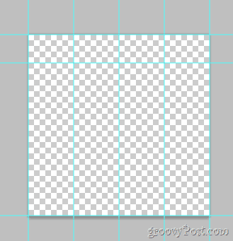
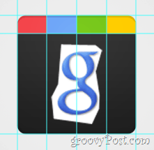
You will need to repeat this step several times to make yourself the following guides (remember, we’re working in pixels, so don’t forget to change the cm in the position box to a px): Horizontal Guides: 0px, 40px, 256px Vertical Guides: 0px, 64px, 128px, 192px, 256px
Once you’re done, your canvas should look like this:
Step 3 – Enlarging Your Canvas
We’ll want to have the Google Plus logo on a smooth white-to-gray background in typical Google style. Click Image, Canvas Size and set the canvas to a wallpaper-like resolution. For this one, we went with 720p (1280×720).
Now pick up the gradient tool and create a radial gradient that fades from white to a light gray. Something similar to this:
Step 4 – Create The Shape
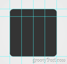
Create a new layer. Now go to the Shape Tools and select the Rounded Rectangle Tool. Change its radius to 20 px and its color to a dark-gray (343434). Now using the guides we made earlier, drag out the rounded shape and make sure it fits nicely into its boundaries.
Step 5 – Top Part Of The Logo
First of all, Rasterize your layer with right-click, Rasterize. Now, using the Rectangular Marquee Tool select the top part of the logo (between the first and second horizontal guides) and then right-click choosing Layer Via Cut. Now, separate the new layer into four smaller layers – each for each top piece: Here’s what it would look like if I enable and then disable each layer one by one:
Quick tip – you can rename your layers and give them names such as top piece 1, top piece 2 and so on. This will not only make things cleaner, but will also make things easier. You can even try putting the top pieces into their own layer group.
Step 5 – Bottom Part Visuals
Select your layer which contains the bottom part of the image… (this one):
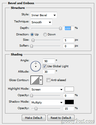
…and then right-click selecting Blending Options. From here you’ll want to add some Bevel and Emboss…
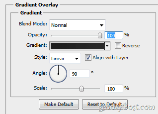
…and a Gradient Overlay (fades from 1d1d1d to 292929).
Your image should afterwards get a change similar to this:
Step 6 – Top Part Visuals
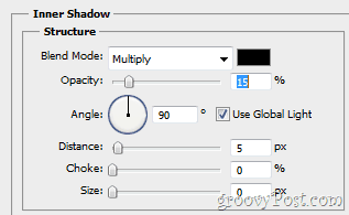
First, make sure you enable your upper left icon piece. Now, again, open that layer’s Blanding Options and give it some Inner Shadow…
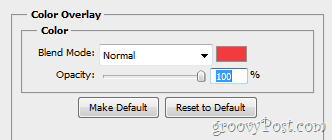
…as well as some Color Overlay.
Here’s what your image should look like before and after the changes:
Repeat this step for each new layer, setting its right overlay color: 1st Piece: Red – f23a3f 2nd Piece: Blue – 5988f5 3rd Piece: Green – 5fb816 4th Piece: Yellow – ffc000
Step 7 – Adding a Slight Glossiness
Make a new layer and place it above all other layers. Now use a Gradient Tool to create a Radial Gradient fading from white to transparency inside of the area of the icon. Then set the Layer Opacity to 30% and the Blending Mode to Overlay. The changes are barely noticeable, but still quite vital. Here’s a quick before/after:
Step 8 – The Almighty g+
Grab a quick screen shot of the Google logo from Google.com. Then paste the shot directly into Photoshop (its layer goes between the Overlay Gradient and the rest of the image) and remove anything but the small letter “g”.
Now you can use any tools you prefer to remove the background from the little “g” and can also use Refine Edge to smooth it out a bit. Then Ctrl + Click the layer thumbnail and then, while having a Rectangular Marquee in your hand right-click and select Fill. Use White at 100% and Normal and you should get to this:
Now for the plus. Well, nothing to discuss here, really. Just grab a Type Tool and find a font that has a nice skinny “+” which is similar to the original logo and get it in the image. When you’re done, you should have this:
Step 9 – The Grand Finally!
One more step awaits! Go to View > Clear Guides to get rid of the Guides, since we will no longer be needing them and then your image will be complete. (Oh, and don’t forget to tap out a quick Ctrl+Shift+S – you wouldn’t want to lose all that hard work, would you?)
Step 10 – Enjoy!
Finally done! But wait, why stop here? Who knows what other cool logos could come out of this template! Go ahead and try out your creativity and see what you come up with.
Comment Name * Email *
Δ Save my name and email and send me emails as new comments are made to this post.


