Using the New Control Center in iOS 11
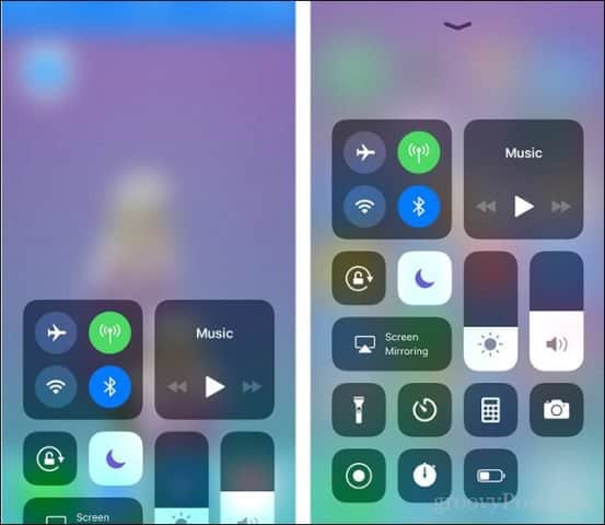
Control Center has evolved over the years, but the last major update came with the totally redesigned iOS 7 in 2013. Since then, improvements to the Control Center has been mostly fit and finish, but this year’s iOS 11 brings a refreshing design change that’s not only beautiful but intuitive and easy to use. When you use the swipe up gesture, you are greeted by a full-screen interface with control panel-like widgets. Gone are the labeled buttons and in their place is a more expressive design with intuitive icons and controls.
I mentioned previously in our Notifications article how much 3D Touch is finally coming into its own. The Control Center embraces it with excellent results. Force press on a widget and additional controls and information blossom. For instance, the network widget, which manages airplane mode, Wi-Fi and Bluetooth might seem like that’s all there is. But press a little harder and it will reveal additional controls like Personal Hotspot, which was once buried deep within the Settings app. This is a welcome feature, since I use it a lot for sharing the internet from my iPhone.
Other controls like volume, brightness, flashlight all benefit from 3D Touch in Control Center.
Add Widgets to the Control Center
Adding and removing widgets is also easy: Just go to Settings > Control Center > Customize Controls. Placing a widget on the Control Center dashboard is like basic math; tap the minus button to remove an existing widget and tap the plus button to add a new widget, done. You can also organize widgets by grabbing the hamburger like menu control then drag and drop where you choose. Placing a widget on the Control Center dashboard is like basic math; tap the minus button to remove an existing widget and tap the plus button to add a new widget and you’re done. You can also organize widgets by grabbing the hamburger menu control then dragging and dropping where you choose. One of my recommended favorites for the new Control Center is the new Screen Recording widget, which makes it quick and easy to fire up when you need it. I also keep a few others I find handy such as Stopwatch, Low Power Mode, and Timer. Voice memos and Notes are two others you might want to add, too, since you have the added benefit of accessing Control Center from within your running apps.
Conclusion
This is what Control Center should have always been like; featuring that classic, fun, playful, easy to use interface Apple software has always been known for. If you just upgraded to iOS 11, it’s one of the first set of improvements you should go check out. We recently covered the improved Notifications too, so make sure to check that out next. Drop a line in the comments and let us know what you think of the new Control Center. Comment Name * Email *
Δ Save my name and email and send me emails as new comments are made to this post.


