Let’s take a peek at the new look, where to find the controls you need, and how to make the most of the new Google Meet design.
Google Meet Before and After
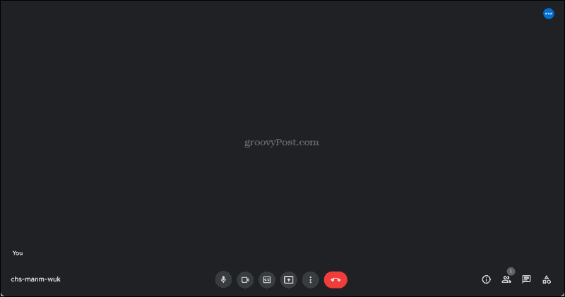
While the previous Google Meet layout wasn’t challenging to use, the new design places all of your controls in the handiest spot, the bottom. Before, you only had a few controls across the bottom with meeting details tucked away. And there was a separate toolbar at the top for participants and communications.
But now, everything is neatly arranged at the bottom, so you only have to glance down to see what you need.
Google Meet Controls and Settings
Let’s take a look at the controls and options from left to right.
Starting on the left side, you have your meeting code. This gives you quick and easy access to it so you can share it with additional participants. If you enter full-screen mode, you’ll also see a clock in the bottom left corner.
Next, you have your microphone and camera controls. These let you mute and unmute yourself or turn your camera off or on with a click. If you want to enable closed captions, that button comes next. You can also select the language for your captions which is ideal if you’re meeting with a group that speaks a different dialect.
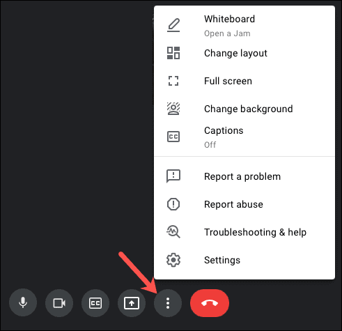
If you have an account that provides the Hand Raise option, you’ll see this in the center of the controls at the bottom. Participants can click this button to let the moderator know they’d like to speak or have a question. The feature is only available for certain Google Workspace editions such as business, enterprise, and education. For a complete list, check out the Google Meet Help page on the feature. Next, you’ll see the presentation button. If you want to present your screen to the audience instead of your face, click and go. To adjust your settings, choose a different layout, change your background, or go into full-screen mode, click the More Options icon (three dots).
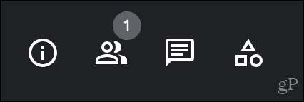
And, of course, you have a big red call button that allows you to end the meeting. Along with the controls at the bottom, you have the communications toolbar. You have the same basic options as before but in a more convenient location.
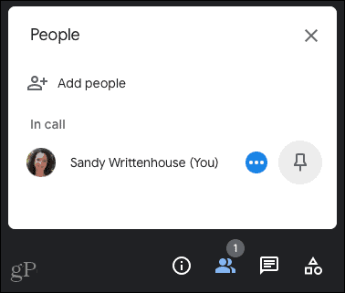
Meeting details: You have a link to the meeting you can copy and paste for others to join, along with any Google Calendar attachments for the meeting. People: See a list of all participants, add more, mute others, and pin or unpin people.
In-Call messages: If you’re chatting with others on the side during the meeting, it all occurs in this spot. Activities: Things like Whiteboard activities show up in this area.
New Meet Features
Along with the upgraded design, you’ll find a few new Google Meet features.
See what you present on-screen along with the meeting participants. You can pin and unpin your presentation view.The updated tile view lets you see more meeting participants at one time. Select More Options > Change layout and choose the tile view.Floating self-view is available when meeting with one other person. You can pin or unpin yourself to switch between the floating picture and tile view. If another participant joins, your self-view is automatically added to the grid.
Easier Access to Controls in Google Meet
The updated design and new features are great improvements to the Google Meet space. You can more easily access the controls you need during your meeting, view people and what you’re presenting simultaneously, and see more participants at once. For more on Google Meet, take a look at how to blur or change your background and schedule a Google Meet if you’re new to the application. Comment Name * Email *
Δ Save my name and email and send me emails as new comments are made to this post.
![]()


