(Click to enlarge screenshots) To start things off, here’s all 7 Microsoft Office 2013 (Home 365 Premium) apps opened up in the File ribbon. Nice!
Microsoft Word 2013
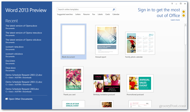
Word’s start screen…
The ribbon hasn’t changed much, but all of the edges are now square.
Document editing in Word 2013 is really smooth. Right away I noticed how the cursor sorta glides along and I’m typing vs. the tick, tick tick common with all other Windows Applications. This might sound like a small thing however I’m really enjoying the new typing groove…
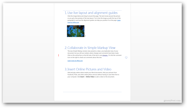
The new Full Screen Mode takes full advantage of every pixel on your monitor or tablet.
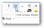
To exit full screen mode there is a hover-over toolbar at the top-right of the screen.
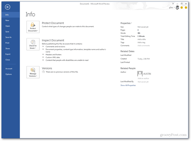
The Word 2013 Info tab. A few new goodies I will be exploring in detail with all you groovyReaders in the coming days.
Nearly everything in Microsoft Office 2013 can be shared directly to the cloud, shared via blogpost or live streaming.
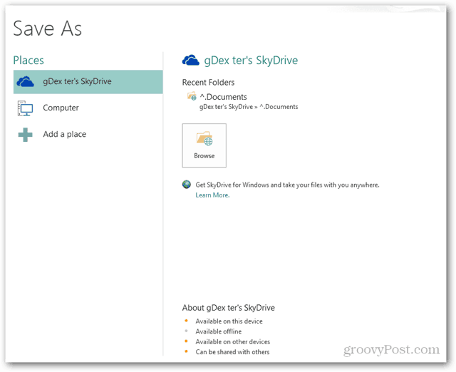
The “Save As” function offers a simplified interface for saving to new locations and of course, SkyDrive.
PowerPoint 2013
PowerPoint hasn’t really changed much at first glance.
Though, I’m really digging the updated Dual-Screen slideshow interface. (click image to enlarge) This will make life a lot easier when presenting via projector.
Outlook 2013
The main inbox screen…
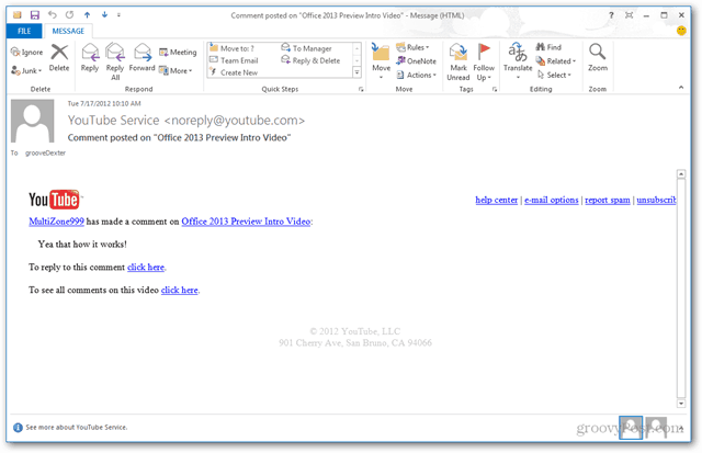
The Calendar looks really nice! Reading and writing individual mail messages… Again, when typing an email I love how smooth the cursor moves across the screen. Playing with Outlook 2013 I can tell there is a lot of new features and UI which will be fun writing about.
Of course Outlook comes with social network integration for Facebook, LinkedIn, and others. All built-in, no plugins required.
OneNote 2013
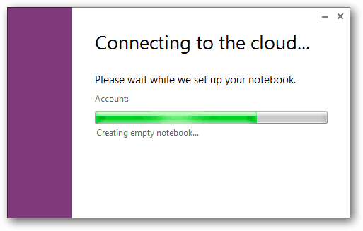
It takes a few moments for OneNote to start, if you’re signed in it creates Notebooks directly on Skydrive (the cloud).
OneNote syncs up to SkyDrive and makes notes available on any internet-capable device.
Drawing works as before, it’s great on a touch-screen.
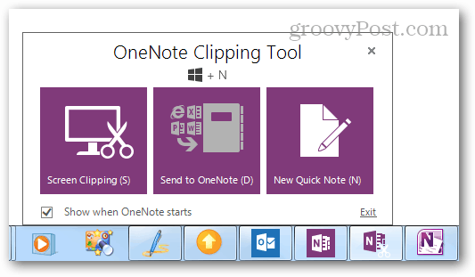
The OneNote Clipping Tool opens alongside OneNote. It can be quick-accessed with Windows Key + N.
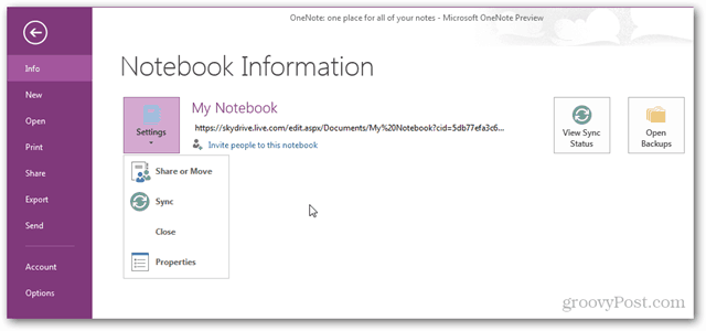
Sync and sharing options in OneNote’s File Menu…
Excel 2013
The Excel 2013 file menu. It hasn’t changed much other than visually.
The export button has some Browser View Options that weren’t in Office 2010.
The 2013 Excel interface is much roomier and clean, but it doesn’t feel like it has changed otherwise. I’ve read there are some Pivot table updates and a few other hidden gems. Stay tuned!
Publisher 2013
The Publisher start page…
Publisher 2013 is nearly identical to Publisher 2010 at first glance.
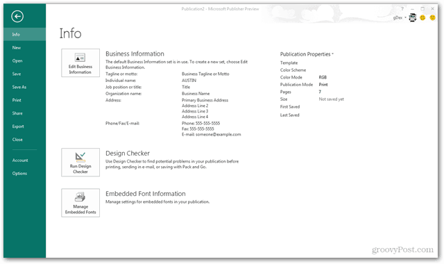
Even the File Menu on Publisher hasn’t changed much, though of course it now integrates directly with SkyDrive.
That’s it for our first-look and quick screenshot tour. What do you think so far? Is Office 2013 the next step for your home Office needs? There is still a lot to be seen and as our groovyTeam continues checking out new features we’ll report back, right here on groovyPost.
Comment Name * Email *
Δ Save my name and email and send me emails as new comments are made to this post.

